CSS, Styling, and Bootstrap
In programming, we said it would be annoying if we had to re-invent the wheel every single time we wanted to do something. Therefore: some bright people designed module systems and standard libraries to package up the sort of tools we find ourselves using over-and-over-and-over again.
Our current goal is to build the interface for a web application. We could approach this in way we did in our original HTML and CSS practice: write content in HTML, then style the content using cascading style sheets (CSS) until we’re satisfied. Alternatively: what if we were equally annoyed by hand-writing HTML and CSS in the same way that it would have been annoying to write a random number generator from scratch every time we wanted to pick a random number?
Enter: components (in a moment).
The field of web design is concerned with how one builds user interfaces for the web. A web designer (similar: front-end developer or front-end engineer)1 works from the foundations provided by HTML, CSS, and JavaScript—and their goal is to build user interfaces. A “good user experience” is that goal. But recall the foundational tools are good for content (HTML), styling (CSS), and interactivity (JavaScript). We might say these tools are low-level. Each are responsible for how things are actually accomplished—but seen several occasions where working at a higher level of abstraction can give one a huge productivity boost.
For example, HTML has generic tags for common elements like headers, buttons, and dividers:
<h1><button><div>
But what about this next thing? Is there an HTML tag for it? Can you name this thing?
This thing is called a modal, or sometimes a dialog box. Modals, accordions, cards, spinners, and tooltips are all things that do not exist in HTML.2 But one can create these by combining HTML and CSS. In other words, each of these things are components: re-usable bits of an interface that may require multiple HTML tags, some custom CSS, and JavaScript to realize the full suite of user interactions on the component.
One approach to user interface design and development works like this: first construct a set of components around a consistent style, then anyone can apply those techniques to any new interface. This is realized through a front-end framework (also called frond-end toolkit or front-end design framework). Variations exist between frameworks,3 but their common goal is is to bundle components and simplify interface development.
The front-end framework we will focus on is Bootstrap. Bootstrap was originally created at Twitter (a social media site popular in the 2010s) as a set of re-usable CSS classes to give Twitter a consistent look. The 2010s were a critical period following the release of the iPhone (2008), and Bootstrap popularized an approach to creating sites with a consistent look-and-feel whether the user was viewing the site from a small screen (mobile device), a medium-sized screen (laptop), or a large screen (desktop). Anyone who has interacted with the world wide web has seen the results of using Bootstrap—the framework is currently being used on 17.7% of all websites.4
High usage suggests two observations. (1) When a tool is popular: it’s solving a problem many people have. (2) Using Bootstrap means you will have a functional, but generic-looking site. We will spend this chapter on a few topics:
- CSS. Enough of an introduction to cascading style sheets that one can recognize how the language is formatted, how the rules work, and how they may be applied to styling user interfaces.
- Bootstrap. A front-end framework with easy-to-use CSS rules. It contains some JavaScript, but the JavaScript can mostly be treated as a behind-the-scenes implementation detail.
- Emmet. A toolkit of snippets and shortcuts to use when writing HTML and CSS. Emmet is included as a built-in plugin for Visual Studio Code. We will introduce some of these as they arise, and recommend trying out some listed in the Emmet cheat sheet: https://docs.emmet.io/cheat-sheet/.
Separating Content from Style
If a web page were a storybook; then the HTML is the content of that story, displayed in a clear hierarchy of: chapters, their titles, and their paragraphs. The CSS is all about the adjectives, adverbs, and descriptive language that make a story memorable. The content is important, but a presentation style is what the user recognizes in their first-person journey through a web page.
We previously saw HTML and CSS when we introduced networks and servers, and introduced HTML tags to represent common types of content:
| HTML Tags for Content | Purpose / Meaning |
|---|---|
<p> | paragraph / default text container |
<h1> | headlines in order of importance |
<ul> | bulleted list / unordered list |
<ol> | numbered list / ordered list |
<li> | list item |
<table> | define table |
<a href="...">...</a> | create a table: row / cell (column) / header |
<img src="..." alt="..."> | place an image |
We learned that there was a generic <div> or “division” to incorporate structure or design elements, but likely were left uncertain about where and how they were used. Furthermore, there were a large number of tags that the introduction implied were important for building web pages, but were not defined until now:
| Required HTML Tags | Purpose / Meaning |
|---|---|
<!DOCTYPE html> | identifies page as HTML |
<html lang="en"> | wraps around your entire web page |
<head> | contains the stuff you don’t see on the page, but need: typically metadata or other machine-readable information |
<meta charset="UTF-8"> | define the page’s encoding to inform the browser how to render specific types of text |
<title>...</title> | title for your website/webpage shown as the title of a browser tab |
<link rel="stylesheet" href="..."> | links your HTML to your CSS (stylesheet) |
<body> | contains the stuff you do see on the page |
The CSS handles the styling and layout of the HTML tags in a web page. Best practices typically recommend to add CSS to its own file (since multiple HTML documents will need to refer to it), and to link the common stylesheet in the <head> of a document. For example:
<link rel="stylesheet" href="css/styles.css">
CSS is designed as another markup language. Each object in the language is a CSS rule informing a web browser how an HTML element (or the page more generally) should appear. Each CSS rule is like the dictionaries we saw in Python: where we mapped a key to a value—the same thing is true here, except in CSS they are called properties and values. The parts of each object are the:
- Selector. A selector corresponds with a specific piece of HTML, usually at the level of tags. A selector is accompanied by braces (
{}, sometimes called curly braces) which demark which selector(s) which are being modified. - Properties. The properties, attributes, or behaviors being modified, usually generic concepts like something’s “color” or “size”.
- Values. The actual value that an attribute takes on. If the attribute is “color”, its value might be set to “orange”.
The combination of a property and a value is a declaration. Declarations use a colon : to separate the property from the value, and end with a semicolon ;. Quiz yourself with the following, what is h1, what is color, and what is center?
h1 {
    color: orange;
    text-align: center;
}
Answer: h1, color, center
h1is a selector: it corresponds with an HTML elementcoloris a property: it corresponds with the way that an element is showncenteris a value: it is a specific way to display the text
More often, CSS rules are given meaningful names called CSS class selectors. In this context, a class is the adjective that modifies how one interprets the HTML nouns. An HTML document containing an article may benefit from having specific types of paragraphs; a lead-in paragraph might need to be styled differently from a generic paragraph, and styled differently still from a concluding byline at the end. Once defined in CSS and loaded (<link>) in an HTML document, a class can be applied to an element using the class= attribute of an HTML tag:
<p class="lead-in"> ... </p>
<p>                 ... </p>
<p class="by-line">  ... </p>
Analogous to how we saw dot notation or attribute-based indexing in Python, CSS classes also use a period/dot character to define new classes. If we define lead-in and by-line classes on the <p> element:
p.lead-in {
    font-style: italic;
}

p.by-line {
    font-style: italic;
    font-size: 18px;
}
… then attribute and value settings will only apply to paragraphs with those classes:
So what is the takeaway from this? We will not spend much time on CSS in this book. You should, however, be able to recognize CSS code when you see its basic syntax and application. As we mentioned: Bootstrap will handle basic styling and layout with a set of prewritten CSS classes. Therefore the takeaway is that Bootstrap abstracts away the need to write some of the CSS, allowing the interface developer time to focus on the final presentation. We will instead spend time learning how to apply Bootstrap classes from within HTML: and recommend returning to the low-level styling details as a topic for another time.
Bootstrap Classes and HTML
Adding Bootstrap to a site can be as simple as including CSS and JavaScript links via <link> and <script> tags, respectively. From Bootstrap - Get started :
<!doctype html>
<html lang="en">
  <head>
    <meta charset="utf-8">
    <meta name="viewport" content="width=device-width, initial-scale=1">
    <title>Bootstrap demo</title>
    <link href="https://cdn.jsdelivr.net/npm/bootstrap@5.3.3/dist/css/bootstrap.min.css" rel="stylesheet" integrity="sha384-QWTKZyjpPEjISv5WaRU9OFeRpok6YctnYmDr5pNlyT2bRjXh0JMhjY6hW+ALEwIH" crossorigin="anonymous">
  </head>
  <body>
    <h1>Hello, world!</h1>
    <script src="https://cdn.jsdelivr.net/npm/bootstrap@5.3.3/dist/js/bootstrap.bundle.min.js" integrity="sha384-YvpcrYf0tY3lHB60NNkmXc5s9fDVZLESaAA55NDzOxhy9GkcIdslK1eN7N6jIeHz" crossorigin="anonymous"></script>
  </body>
</html>
When Bootstrap is added to your site, its pre-written CSS applies automatically. Furthermore, specific CSS classes may be applied to your HTML elements in the form of class attributes. A class attribute applies a CSS class selector to an HTML tag, such as the <p class="lead-in"> that we showed earlier. Bootstrap classes are typically applied in four ways, which we’ll call the:
- Reset,
- Singleton class,
- Multi-class/Mixin, or
- Component
… approaches. This vocabulary comes up throughout web development. We’ll provide brief examples of each in Bootstrap. But for most day-to-day problems: one can usually pick up which one is correct in which situation by reading examples from documentation.
Bootstrap Reset
Bootstrap provides default styling: As a web designer, you can apply zero classes to an HTML element and Bootstrap will apply some default styling. If you aren’t using Bootstrap, every web browser also has a built in stylesheet, but it’s very basic. This approach is sometimes called a Reboot or CSS Reboot (e.g. Bootstrap Reboot ), because overwriting every web browser style effectively resets behavior to some other state, making appearance consistent across browsers.
Without a single class—Bootstrap changes everything from font, to its size, to the document’s background color:
Bootstrap - Singleton Classes
Singleton classes modify a specific HTML element to look a certain way. If you can express an idea like: “big heading”, “opening paragraph”, “unstyled-list”, etc., the concept is usually implemented by adding a class="..." to a desired HTML element.
Notice in the following how classes are set in the opening HTML tag and never in the closing tag? Notice how there is a space between the name of the tag p and the attribute class="lead", but no spaces within the attribute syntax?
<h2 class="display-5">The Bootstrap Reset</h2>
<p class="lead">
    A reset, or browser reset, shadows the default CSS
    used by browsers.
</p>
Applying classes like these change how particular elements are displayed by the browser. When building interfaces (or sites more generally), these extend the HTML vocabulary with variations on concepts:
Bootstrap - Multiple Classes and Mixins
One can apply multiple classes to an HTML element. Just put a space between the class names. This is sometimes called a mixin approach—because one creates a desired effect by “mixing together” multiple simple classes.
For example: Alexander felt claustraphobic looking at the previous examples—with the text crammed against the left and top of the screen. It would look nicer if there was some spacing at the top, and equally on the left and right sides. This could be fixed by wrapping everything in a <div> element with a medium margin at the top: mt-3, and a container to handle left and right spacing.
<div class="container mt-3">
    <h2 class="display-5">The Bootstrap Reset</h2>
    ...
</div>
Much better:
Bootstrap - Components
Components are higher-level pieces of an interface which combine aspects of the three previous ideas. Components are also one of the biggest productivity advantages to using a framework like Bootstrap, particularly if one needs things like forms, modals, navigation, or other heavily user-driven elements.
For example, the Bootstrap Modal that we saw earlier is created by applying the modal singleton class, then the position-static and d-block mixins. Within a modal: there are additional steps to express the modal-content, modal-header, modal-title, and even more attributes (e.g. “data attributes”) to fine-tune their behavior.
Do you have to memorize all of these? No! But there is a lesson to be learned for everything we have seen so far: The documentation is your friend. Experts with years of experience working on Bootstrap probably know everything in the documentation, but when you’re starting out: leveraging that expert knowledge typically requires reading documentation. Enough that you can read an example such as this:
<div class="modal position-static d-block" tabindex="-1">
    <div class="modal-dialog">
        <div class="modal-content">
            <div class="modal-header">
                <h5 class="modal-title">Confirm?</h5>
                <button type="button" class="btn-close" data-bs-dismiss="modal" aria-label="Close"></button>
            </div>
            <div class="modal-body">
                <p>Make sure you save your changes first.</p>
            </div>
            <div class="modal-footer">
                <button type="button" class="btn btn-secondary" data-bs-dismiss="modal">Close</button>
                <button type="button" class="btn btn-primary">Save changes</button>
            </div>
        </div>
    </div>
</div>
… and intuit how it translates into the user seeing this:
JavaScript and Interactive Components
Soon we will need to figure out what “interactive” means—but not yet. HTML and CSS are layout and styling languages. Interactivity—the means by which someone uses an interface to accomplish their goals—requires us to “wire up” the front end of an application to something that actually implements the logic.
The way one “wires up” components on the front end to a programming language typically goes through a few HTML attributes:
idnamedata-*
Briefly: Bootstrap might make use of the id attribute of a component to make them interactive. Flask will make use of the name attribute. Finally, data-* attributes configure Bootstrap plugins and hold behind-the-scenes data for specific components (for example, the modal example included a data-bs-dismiss attribute to annotate which buttons the user could click to dismiss the modal).
Such an element uses multiple attributes, similar to:
<div class="dropdown" id="action-items">...</div>
In context, notice how the following <form> element contains an <input> and <label>. Both refer to a userEmail identifier: defined in the input, then used by the label.
<form class="form-floating">
  <input
    type="email"
    class="form-control"
    id="userEmail"
    name="userEmail"
    placeholder="name@example.com">
  <label for="userEmail">What's a good email for you?</label>
</form>
Some Concluding Remarks
To reiterate: it’s not important to memorize the classes and ids to use—Bootstrap’s documentation will tell you. Focus instead on what you want to show to a user, translate that into something in Bootstrap (Grid, Images, Tables, Select, Button), and how to adjust an example to fit a new use case.
In documentation, you will typically see:
...- dot-dot-dot is a placeholder for you to fill inExample- represents a name you’ll want to change<a href="#">- hashsign should be replaced with a relative path or a URL
Follow Along with the Instructor
Practice with the instructor and learn some more VS Code shortcuts. As always: the video is not an exact replacement for the written directions and vice versa.
Practice
Today we will create a “cheat sheet” web page linking to parts of the Bootstrap documentation, practice centering, and practice the Bootstrap grid:
01 Open the Bootstrap Documentation
Open the Bootstrap documentation. Take a look around. As concepts come up during practice, find a relevant section of the documentation: either with the “Search” functionality, or using the table of contents along the left side of the screen.
02 Set up
Continue to work out of your https://github.iu.edu/i211su2024/USERNAME-i211-starter today.
At the command line, change into the directory where your i211-starter repo is located. Set up a directory for a static site. Then open the repository in VS Code.
cd USERNAME-i211-starter
mkdir bootstrap-practice
cd bootstrap-practice
code .
Note - reminder that your instructor is working just locally, with no repo, the video was made before we had decided what repos to provide to you. Continue to work out of the same local repo you used for Rock Paper Scissors. You’ll be creating a folder for another static website. If Live Server doesn’t work for you, run it locally (open the HTML files on your computer in a browser) to see what it looks like. No worries about pushing it to production or running on a web server.
We’ll work with just one HTML page today and a simplified structure so we can focus on practicing with Bootstrap.
In bootstrap-practice, create the following file structure:
bootstrap-practice
├── practice.html
└── images/
03 Download a logo to use in the site
Right-click to download the image.

Drag the image (maybe from your computer’s “Downloads” folder) into the images/ folder we just created. Your site structure should now look like this:
bootstrap-practice
├── practice.html
└── images/
    └── bootstrap.png
04 HTML Boilerplate and Bootstrap
Add this HTML to practice.html:
<!doctype html>
<html lang="en">
<head>
    <meta charset="utf-8">
    <meta name="viewport" content="width=device-width, initial-scale=1">
    <title>Bootstrap Practice</title>
    <link href="https://cdn.jsdelivr.net/npm/bootstrap@5.3.3/dist/css/bootstrap.min.css" rel="stylesheet"
        integrity="sha384-QWTKZyjpPEjISv5WaRU9OFeRpok6YctnYmDr5pNlyT2bRjXh0JMhjY6hW+ALEwIH" crossorigin="anonymous">
</head>
<body>
    <!-- Add content here -->
    <script src="https://cdn.jsdelivr.net/npm/bootstrap@5.3.3/dist/js/bootstrap.bundle.min.js"
        integrity="sha384-YvpcrYf0tY3lHB60NNkmXc5s9fDVZLESaAA55NDzOxhy9GkcIdslK1eN7N6jIeHz"
        crossorigin="anonymous"></script>
</body>
</html>
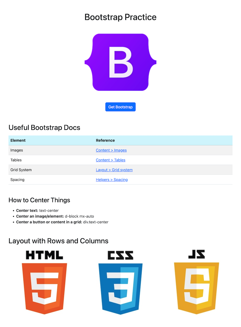
05 Add content to the body
Add this code to the body of practice.html:
    <div class="container mt-5">
        <h1 class="text-center">Bootstrap Practice</h1>
        <img src="images/bootstrap.png" class="img-fluid d-block mx-auto my-5" alt="bootstrap logo">
        <div class="text-center">
            <a class="btn btn-primary" href="https://getbootstrap.com/" role="button">Get Bootstrap</a>
        </div>
    </div>
Pay attention to:
- In Bootstrap, content goes inside a “container” class
img: a relative pathname is used for the image’s source, meaning the path based on where the HTML page lives in relation to the image we want to appear- The content is being centered using three different techniques
- Notice that spacing is handled by classes beginning with an “m” (more on that soon)
To view the page, click “Go Live” in the bottom right corner of VS Code.
06 Add a table of documentation links
Hint: In the Bootstrap Documentation go to Content > Tables
- Add an
h2called “Bootstrap Docs” - Add a
tablewith atheadand atbodytag similar to the one in the first example in the documentation - In the
thead, place a row with two table heading (TH) columns called “Element” and “Reference” - In the
tbody, place four rows and add the following content:
Images
Content > Images
https://getbootstrap.com/docs/5.3/content/images/

Tables
Content > Tables
https://getbootstrap.com/docs/5.3/getting-started/introduction/

Grid System
Layout > Grid system
https://getbootstrap.com/docs/5.3/layout/grid/

Spacing
Helpers > Spacing
https://getbootstrap.com/docs/5.3/utilities/spacing/
07 Add a list of tips
Hint: In the Bootstrap Documentation, look for Layout > Grid
- Add an
h3with the title “How to Center Things” - Create an unordered list with the following content:
Center text: text-center
Center an image/element: d-block mx-auto
Center a button or content in a grid: div.text-center
08 Create a grid of images
Add an h2 with the title “Layout with Rows and Columns”
Right-click to download the following three images, put them in our site’s images/ directory.


Add the following code and use the documentation to figure out what these classes mean:
<div class="row g-3 text-center">
    <div class="col-12 col-md-4">
        <img src="images/html.jpg" alt="html">
    </div>
    <div class="col-12 col-md-4">
        <img src="images/css.jpg" alt="css">
    </div>
    <div class="col-12 col-md-4">
        <img src="images/js.jpg" alt="js">
    </div>
</div>
Solution: what do the classes mean?
In the final listing with rows and columns:
- the most basic row and column setup includes the
rowclass wrapped around one or morecolclassesg-3provides a medium sized gap between the elements (values are from 1-5)text-centercenters the table on the screenBootstrap provides columns made of up to 12 pieces. This allows for you to set a column to be full width (12), half width (6), a third (4) or a quarter (3) of the row.
col-12means that in a mobile view, each column will stretch to fill the entire rowcol-md-4means when the viewport is a medium width, each column will fill a third of a row
09 Adjust the spacing
In the Bootstrap Documentation, go to: Utilities > Spacing
- On all
h2orh3headlines, add a level 5 amount of margin on the top, and a level 3 amount of margin on the bottom. - On the
row(the last element in our content, has a class “row” applied), add a level 5 amount of margin to the bottom.
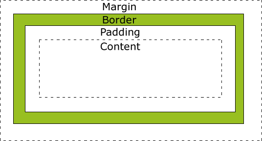
Hints: Bootstrap Spacing Formula
Spacing in Bootstrap has a formula. To understand this formula, we need to be aware of the two areas where space can be added.
- margin - the space around the element
- padding - the space between the content and edge of the element
(The border can be set to be visible, but is not set by default)
We also need to understand that all elements are boxes!
Whether we see the edges of that box or not, all tags are creating a box. The sides of an element can be set all together, or as a pair like top-bottom or left-right , or individually as top, right, bottom, and left.
10 Review and final fixes
Review your site so far and make any additional changes to tidy up its presentation.
When complete: commit and sync your changes with your GitHub repository.
(Bonus) Aesthetic preferences
Bootstrap provides many variations on the vanilla elements. Different preferences have associated classes mentioned in the documentation.
- Can you make the table striped?
- Can you give a hover effect to each row of the table?
- Can you change the background color for the
theadrow? - Can you make the first part of each list item either bold (
strongtag) or italic (emtag, for emphasis)?
Further Reading
- MDN Web Docs: Getting Started with HTML
- MDN Web Docs: HTML tag reference
- MDN Web Docs: Class selectors
- Bootstrap - Getting Started: JavaScript: Data Attributes
- MDN Web Docs: id
- MDN Web Docs: data
- MDN Web Docs: Using data attributes
Footnotes
There are distinctions between the roles of web designer, front-end developer, and front-end engineer: but in an introduction we will mostly treat these as aspects of the same end goal. Many roles in computing blur into each other, as roles are often problem-specific or team-specific. A front-end developer on a team with three people might be the only person who knows about user interfaces, implying many responsibilities. When these roles do have strong demarcations between them (read: on large teams) a designer works directly with end users to come up with an interface, a developer implements it, and the engineer connects the two (even if requires inventing new approaches or frameworks that didn’t exist previously).
In the next few years we may think differently about this modal example. As we mentioned: the HTML standard is evolving, and as of 2022 the <dialog> element was implemented by all major web browsers. Nevertheless, older devices still exist, and may not support the new features. Because of this: components built from better-supported tags remain common. See also: https://developer.mozilla.org/en-US/docs/Web/HTML/Element/dialog
Writing that “variations exist between front-end frameworks” is an understatement. It’s like saying that “variations exist between programming languages”—vacuously true to the point of sounding ridiculous. Bootstrap is a batteries included framework: supporting many pre-built components, and general grid, font, and sizing approaches. In a course that goes beyond this cursory introduction: front-end frameworks like React, Vue, Svelte, Solid—there are too many to name—are designed to build user interfaces, but also to handle some of the trickier parts around creating new components. In other words: they are designed to handle the state management problem we’ve seen several times. We avoid state management on the front end, as it is a topic for a class that goes deeper into JavaScript.
“Usage statistics and market share of Bootstrap for websites”, W3Techs. Accessed: 2024-07-02, Online: https://w3techs.com/technologies/details/cs-bootstrap